The MLA Style Center
product design | web development
The challenge
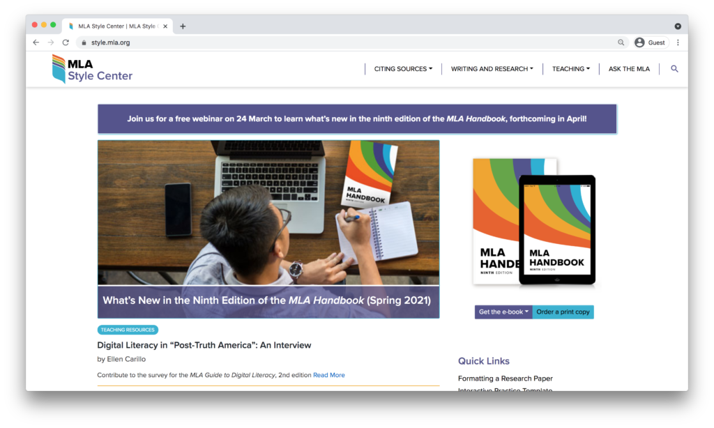
The MLA Handbook and its corresponding MLA style is the most recognizable initiative at the Modern Language Association. Millions of high school, undergraduate, and graduate students use MLA style in their academic writing. Even though there are many sources of information about MLA style online, including citation generators and online writing labs, the MLA is the only authorized source of information. With the publication of the eighth edition of the handbook, the MLA launched a companion website for writing tips, documentation help, and a feature to ask MLA help. Over the first few years of the MLA Style Center, we amassed a large number of citation examples, helpful posts, and lesson plans. As the site grew, much of the content became hard to find so we decided to redesign the site to include interactive features and improve the ease with which students and teachers could browse content.

New features
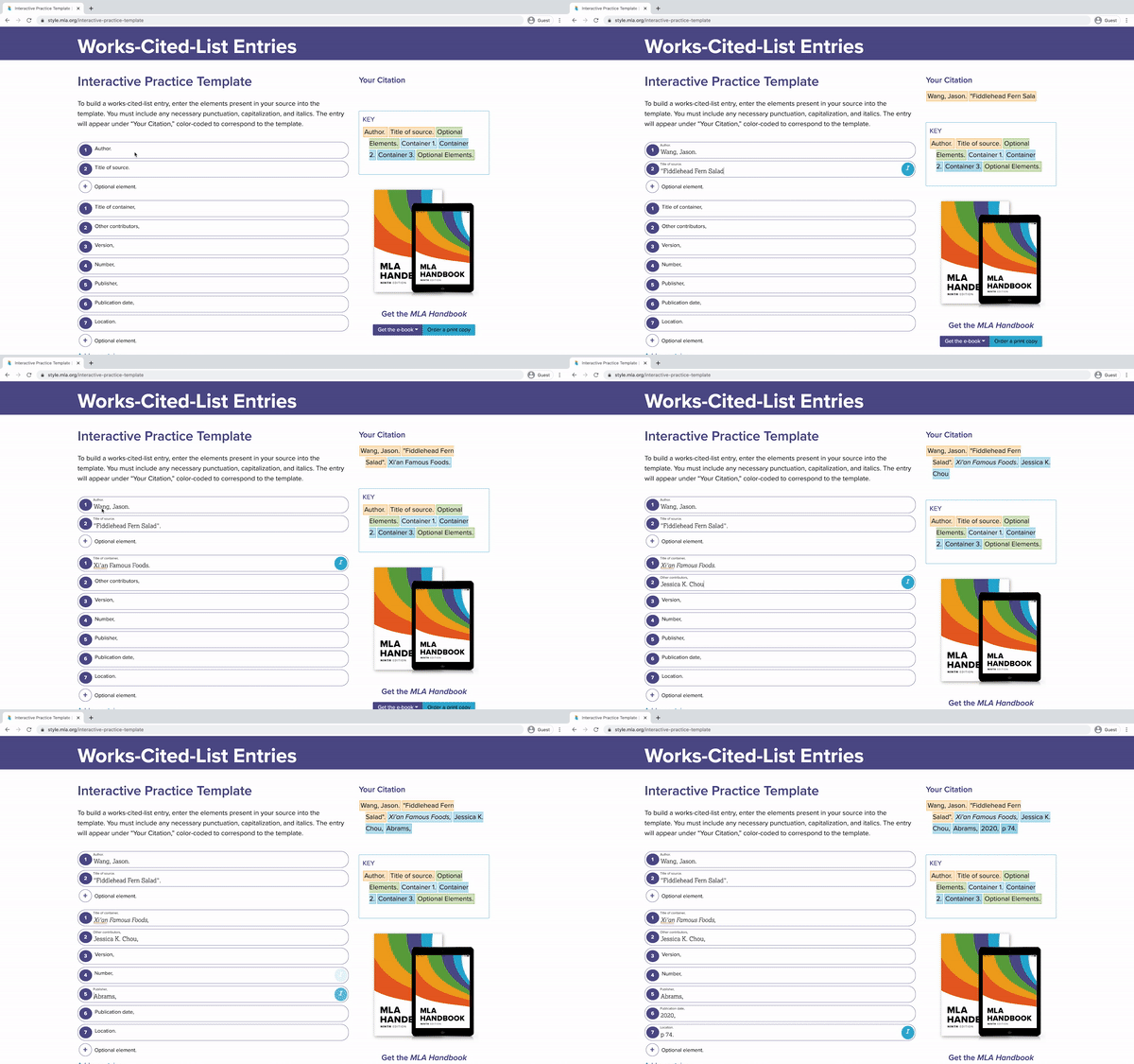
From our user research and SEO analysis, we knew that many people were not using the Style Center for simple, quick advice about how to cite a particular source in their papers even though that remained an important SEO acquisition channel. Instead, they would use one of the many citation generators available online. We did not want to make our own generator, since the goal of the site is to educate students about documentation instead of simply spitting out a bibliography. Instead, I designed and created a practice template that allowed students to follow the MLA style process to create their own citations in a way similar to citation generators.

This was not only a helpful tool for students and a valuable teaching resource for instructors. It also allowed staff admins to begin creating our own repository of citation examples. Previously, there were lots of examples across the site, but they were not structured database objects. Now, editors are able to create and store citation examples and surface them in new ways using a simple shortcode. Because this tool structures the content intelligently, it opens the door for organizing and displaying citation examples in new ways, which is one of the main drivers of traffic to the site.
The result
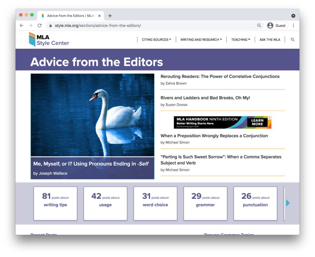
One of the other changes we made to the UX of the site was to allow for more exploratory discovery of content. Instead of just conventional chronological postings, the new design encourage more topic-based browsing and improved the responsiveness of the site. We also widgetized many content areas, allowing the editors to easily highlight or feature articles, sections, or topics easily. And the improved UX is paying off. Since redesigning the site, many important KPIs are improving, including an 18% increase in time on page, and a 14% increase in monthly active users.
