Miles to Go Fundraising Site
UX/UI Design | web development
The project
For my first NYC marathon, I decided to run as part of the Housing Works charity team and pledged to raise $2,500 for the organization. Although Housing Works used a fundraising platform to handle the donations, I wanted to find a more creative, interactive way to engage family and friends with my training and fundraising progress, so I designed and developed a site that tracked my runs and fundraising and provided a place for occasional posts about the process, which I sent out to donors as a periodic newsletter.

Goals and Features
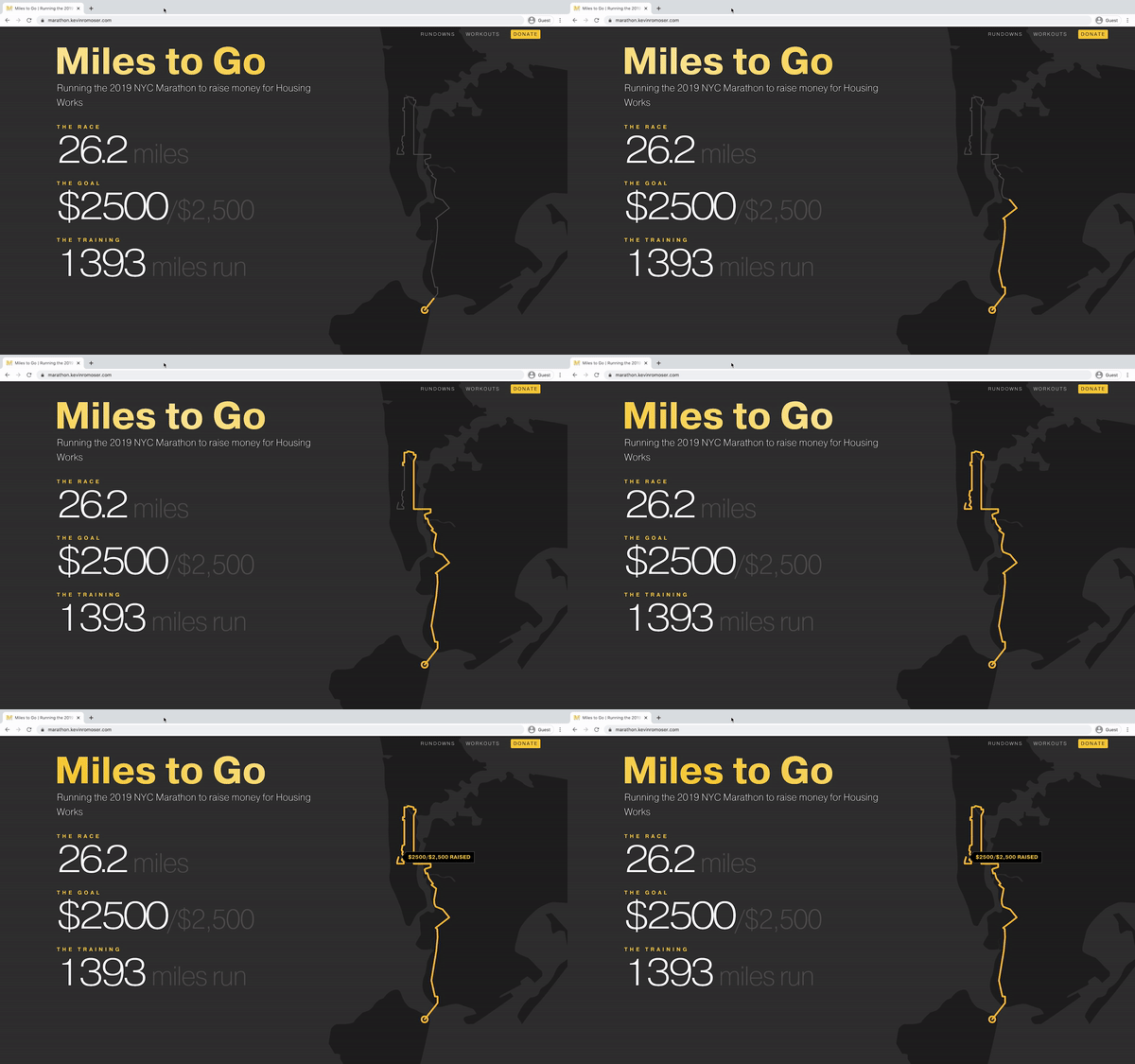
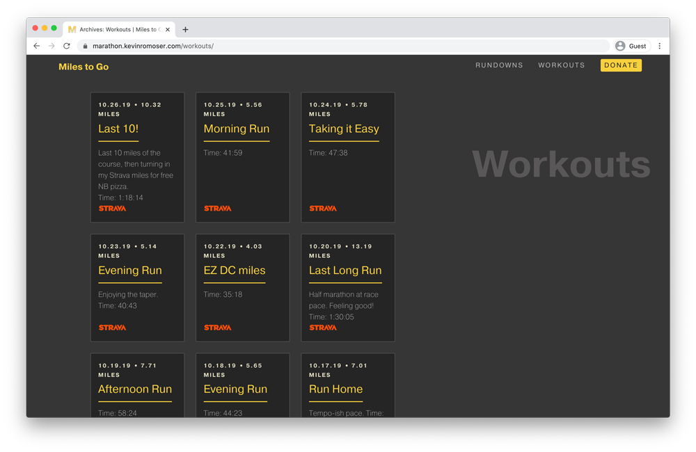
I wanted the site to be a place to stay in touch with family and friends as well as track my training and fundraising. I built the ability to integrate my workouts on Strava, a popular fitness tracking app, which allowed me to aggregate and display information about all of my runs, and I kept the site updated with fundraising progress. As the main focal point on the homepage, I included these top line numbers and displayed funds raised as an SVG that animated the progress over a map of the marathon course.
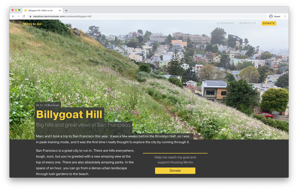
Individual runs were pulled from Strava and displayed as custom post types on the site, and I designed a blog template that highlighted photography from some of the most notable runs I did over the course of the training cycle. Overall the site was a good vehicle to explore a few new front-end development animation techniques, while keeping me accountable during training and fundraising. In the future, I plan to create a version that others can use for their own fundraising for various races.

