MLA Design System
branding | project management | web development
The challenge
The MLA has a large suite of products and services and a diverse set of customers, members, and constituents. Traditionally, each initiative has had its own branding, platform, content strategy, and marketing assets. As a result, there was a lot of brand confusion, and it became hard to highlight and market all of the projects the MLA led.

The goal
We wanted to update the MLA logo, and in the process, begin to build out a design system that would integrate the various MLA initiatives under one cohesive brand voice. We wanted to create a developer-friendly component library, provide clear color, font, and graphic guidelines for designers, and build a framework for designing and developing print and digital materials more efficiently.
The process
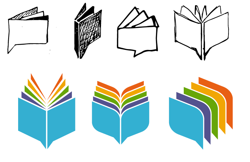
I led this project in consultation with senior staff to brainstorm and design a new logo and branding for the MLA and its various initiatives. For iconography, I drew on concepts such as communication, knowledge, and connection to highlight the foundational principle that the MLA is a network of scholars. Early iterations played with more literal interpretations of a book’s pages, while the finished design married that concept with iconography evocative of a speech bubble, flags, and wings.

For color, I found inspiration in the palette of our most iconic asset, the MLA Handbook. I used colors adapted from the first edition of the handbook semantically, so each MLA arm had a clear visual distinction while keeping it closely integrated with the larger MLA branding.
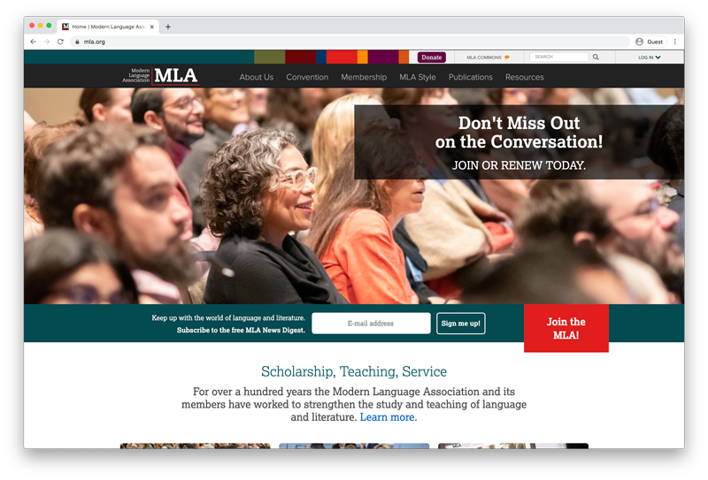
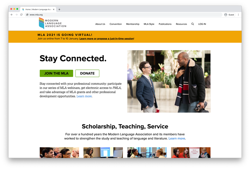
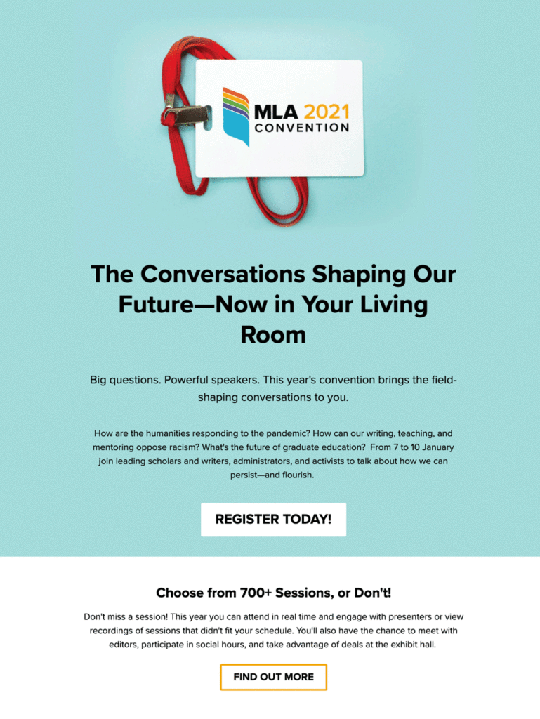
I then extended the logo concept to new UI elements and led a small team of developers to implement the burgeoning design system on our main website and related applications. As part of this, I started a component library, which provided a framework for developers and designer to more quickly create new applications and web properties. I also completely rebuilt our email campaign library, so all of our various newsletter and correspondence templates were more cohesive and recognizable under one MLA brand.
The result
Ultimately, we launched the redesigned website on time to warm feedback from both staff and members. The design system and rebranding has reduced brand confusion, made it quicker to create application front ends, logo extensions, email campaigns, and print materials. As a living, dynamic resource, we are constantly evolving and growing the design system to meet new needs and inform the look and feel of new products.


